
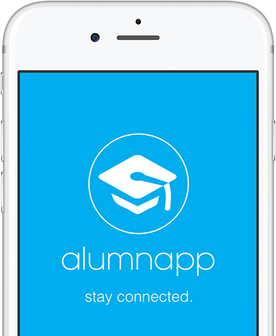
Overview
Alumnapp is a UX/UI design project for an Alumni Association which provides an intuitive and easy to use application for students to share their data with the University. My role in the project involved user research, userflows, sitemaps, logo design, style guide, wireframes and a high-fidelity clickable prototype.
Challenge
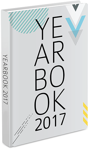
Every year the University puts together a yearbook that features success stories of the alumni and current students along-with their achievements. They used to gather this data through different ways including emails, phone and printed forms dropped in person to the Alumni office. The challenge was to find a solution to streamline this process and have a common platform on which they can receive and view all student profiles.
Solution
Alumnapp bridges the gap between the University and students, it allows the University to gather information for the annual yearbook and also update students about events and activities through notifications. The app offers the user to create an account to fill in his/her information through forms, it also allows the user to access phone’s camera and the saved photos, giving an option to either take a new photo or upload an existing one.
User Research
Before even diving into the features and the overall UX of the product, I sent out an online survey to 30 people which were divided in two groups; students and staff members. It was quite challenging to get the students to fill out the survey forms which took around 3 weeks to complete the task. Later, I conducted some interviews on Skype to gain a better understanding of the problem and create a better workflow for people at the university who prepare the yearbook.
These are some of the key findings from those interviews:
Students
- All of them preferred checking alumni updates on Facebook rather than checking the alumni website
- The students are normally notified about the yearbook through teachers or other students, it would be more effective if they get updates through a social media platform
- All respondents showed interest to having e-forms on the website which are also linked to social media websites
- All respondents find it convenient to send information through a mobile application
Staff
- Normally it takes the staff between 4-6 months to prepare the yearbook
- They have to go through a long process to gather feedback from students which gets pretty frustrating
- They believe that students are more comfortable using mobile apps than website, so they created a mobile version of the website which received excellent response
- All respondents believed if there’s is an application that gathers all information including photographs based on the required specs will speed up the entire process
Heuristics Analysis
Based on the guidelines by the Nielsen Norman Group, I picked five heuristics to evaluate the following three competitors
The findings helped me take care of the following things while creating the app:
• To have a modern yet minimalist design and make sure the content is well organized so it’s easier for the user to navigate through.
• The language should be clear and easy to understand.
• Make sure the error messages are consistent and easy to understand helping the user to navigate through intuitively.
View Details
1. Match between system and the real world
All of them did well, the language used was clear and easy to understand and pretty straight forward giving the user a reason to stay connected.
2. User control and freedom
Brock and Humber passed but SFU failed due to a couple of reasons
• The form was pretty long with no option to preview it before submitting.
• After submitting the form the user doesn’t get any notification whether it was submitted successfully.
• Instructions below ‘submit’ button were not clear and could be missed by the user.
3. Recognition rather than recall
All three competitors passed, the content was well structured and the visibility of objects/options were clear for the user to easily navigate through intuitively.
4. Aesthetic and minimalist design
Brock and Humber passed, both had a modern look with minimalist design making it easier for the user to go through the content. SFU failed, the design needs to be updated as it looked too busy for the user to navigate through.
5. Help user recognize, diagnose and recover from errors
Brock and Humber passed, the language used for error messages is easy to understand and precisely points the user to the fields with missing information. SFU failed, although the message is easy to understand but doesn't precisely point where the errors are and what needs to be corrected and there's no consistency of error handling across all available forms.
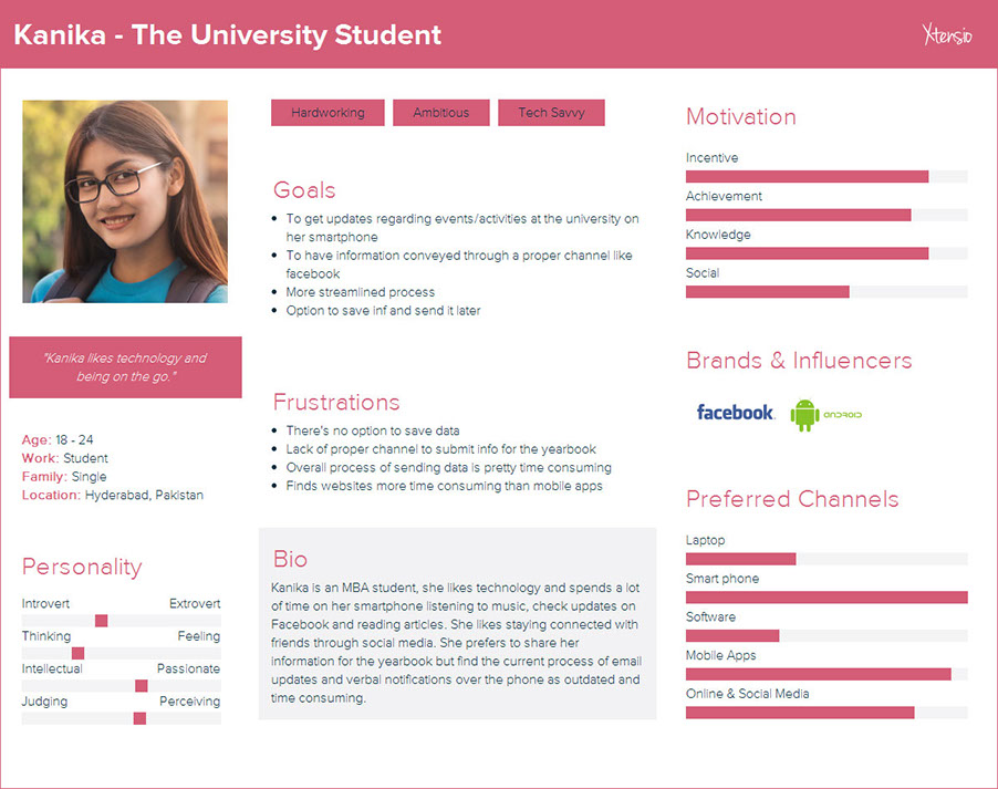
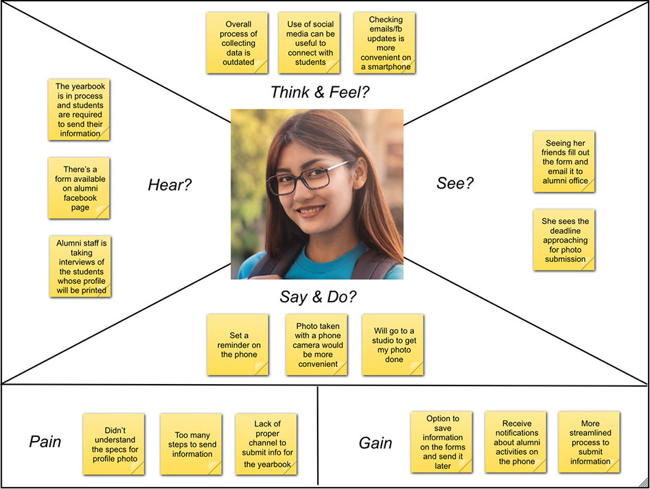
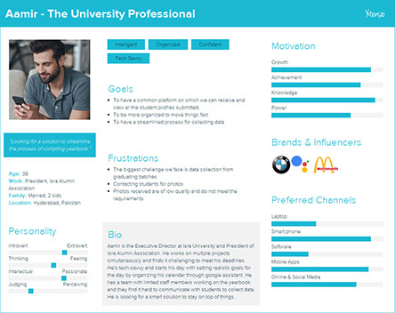
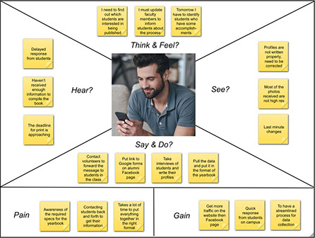
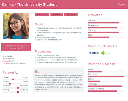
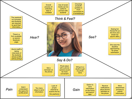
Personas and Empathy Maps
Based on the research through surveys and interviews, two personas and empathy maps were created to get a better understanding of end users which helped in making informed design decisions.


Content Strategy
By analysing the personas and empathy maps it helped me to narrow down the main features by defining the Minimum Viable Product. Based on the information acquired through user research, user stories were created to define the scope of the app.
Minimum Viable Product
The general idea behind the app is to streamline the process of gathering data for the alumni yearbook. Three main features of the app are:
- The user fills in his/her information including biodata, academic achievements through forms which will be saved realtime enabling the user to resume the task later
- The app will have access to the phone’s camera and the saved photos, giving an option to either take a new photo or upload an existing one
- The User will receive notifications regarding activities/events to stay connected
User Stories
Fill in information
• As a user, I want to create an account so that I can access my profile
• As a user, I want to use forms so that I can fill in information
• As a user, I want to save my information so that I can send it later
• As a user, I want to have an option to edit my information so that I can change it before submission
• As a user, I want to see a preview of the form so that I can proofread before submitting it
Photo submission
As a user, I want to have an option to upload an existing photo saved on my phone
As a user, I want to make sure that the photo I’m using meets the requirement
As a user, I want to access my phone’s camera so that I can take a photo instantly
As a user, I want to see a preview of the photo taken from my phone’s camera
As a user, I want an option to retake a photo so that I can choose to send it or not
Notifications
As a user, I want to receive notifications about on-campus events and activities
As a user, I want to receive a notification when the yearbook process has started
As a user, I want to receive notification when the alumni website or facebook page is updated
As a user, I want to receive a notification about successful submission of my information
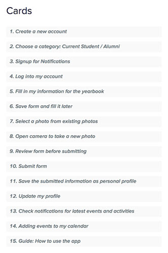
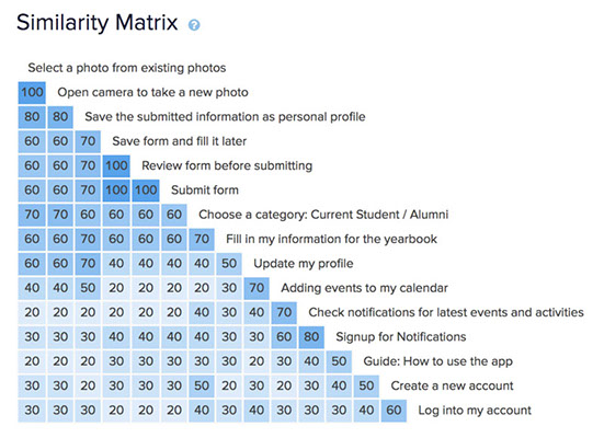
Card Sort
For the card sort, there were several tasks for the users to do including; creating an account, fill the form, access camera to take a new photo and save information as personal profile. Some of the tasks were easily grouped such as the ones related to filling personal information, creating profile and photo related tasks while others were grouped in different categories.
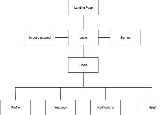
Site Map
Based on the groupings from card sort, I created a site map which will allow the users to easily navigate through the app.
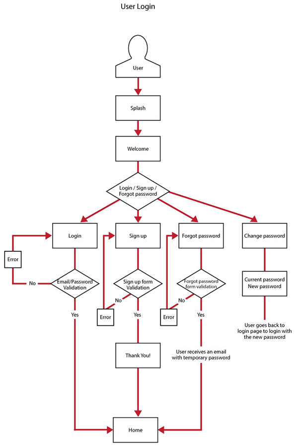
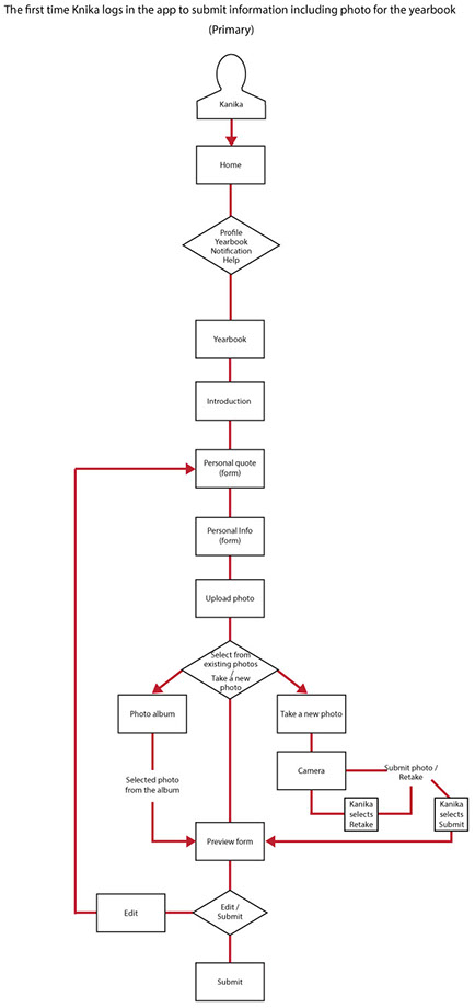
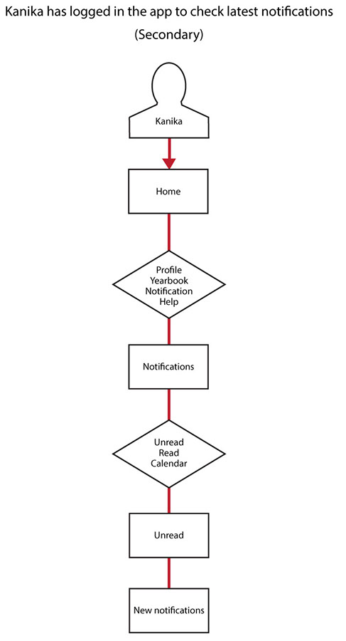
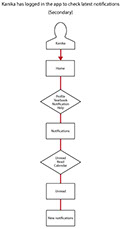
User Flows
Next, I created user flows to visualize the complete path that user will follow to successfully navigate through the app.
Prototype
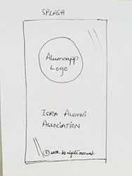
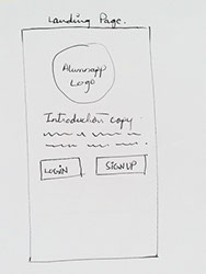
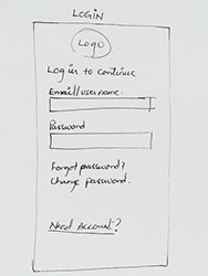
Sketches
To work on the prototype, before heading to the computer I made quick sketches of the screens based on the findings from the site map and user flows to create a basic structure of the design.
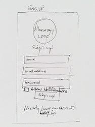
See More Sketches
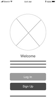
Wireframes
After achieving the basic structure of the app, next step was to convert the sketches to wireframes. While creating the screens in Sketch, I realised that there were many more screens required based on the findings from heuristic analysis. It was quite interesting to see how the design was evolving.
.jpg?crc=123763483)
See More Wireframes
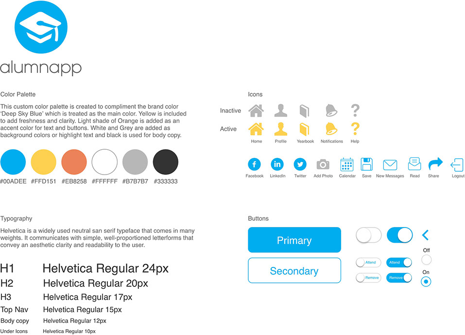
Style Guide
The next task was to create a style guide which defines the elements that will be used in the design. The guide included the logo, colors, fonts, and icons. This helped speed up the next step of designing the final screens, as all the design elements were in place.
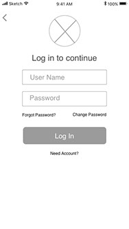
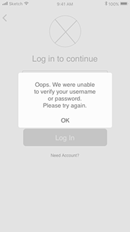
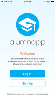
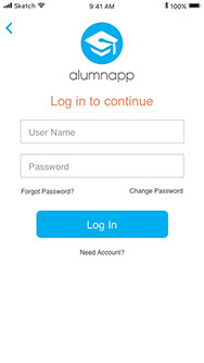
Final Prototype
Based on the style guide, I started preparing the final prototype by converting the static wireframes to actual screens. In this process, I figured that it needed even more screens in order to guide the user through different possible combination of scenarios. I used Invision to create a clickable prototype.
.jpg?crc=4123913982)
.jpg?crc=85056885)
See All Prototype Screens
Usability Testing
When the prototype was ready, I performed a usability test to validate the design with three users. Each user was given fours tasks to perform. All three users could easily use the app without any hassle. The only confusion that was caused was due to using a prototype tool for the first time instead of an actual app which they could easily figured out as they progressed. One of the users got confused by the word 'Read' in notifications which he suggested to change it to 'Inbox'. The suggested change was later implemented. Overall the feedback was positive as all the users found the app pretty straight forward.
View Details